







Web Design for Schools: A Complete Checklist for Better Admissions
This complete checklist will help you audit, fix, and optimize your school’s website to turn passive browsers into enrolled students.
Why School Websites Fail to Convert Parents
Before diving into the checklist, understand the core problem. Parents are busy, overwhelmed, and often researching multiple schools on their phones during lunch breaks or late at night. If your web design for schools does not prioritize speed, trust signals, and friction-free forms, those parents will never schedule a tour or submit an application.
The Complete AEO-Ready Checklist for Better Admissions
Below is the direct answer to “What should a school website include to increase admissions?” organized for quick scanning and featured snippet potential.
1. Mobile-First Navigation (Non-Negotiable)
Over 60% of school website traffic comes from smartphones. Your design must:
-
Use thumb-friendly menu buttons (not tiny links)
-
Display click-to-call phone numbers for admissions
-
Show a sticky “Apply Now” or “Visit Us” button on scroll
Without mobile-first web design for schools, you are invisible to parents searching on the go.
2. Speed That Respects a Parent’s Time
Google data shows that a 1-second delay in page load reduces conversions by 20%. Run your school site through Google PageSpeed Insights. Fix:
-
Oversized images (compress everything)
-
Render-blocking JavaScript
-
Slow hosting (upgrade if needed)
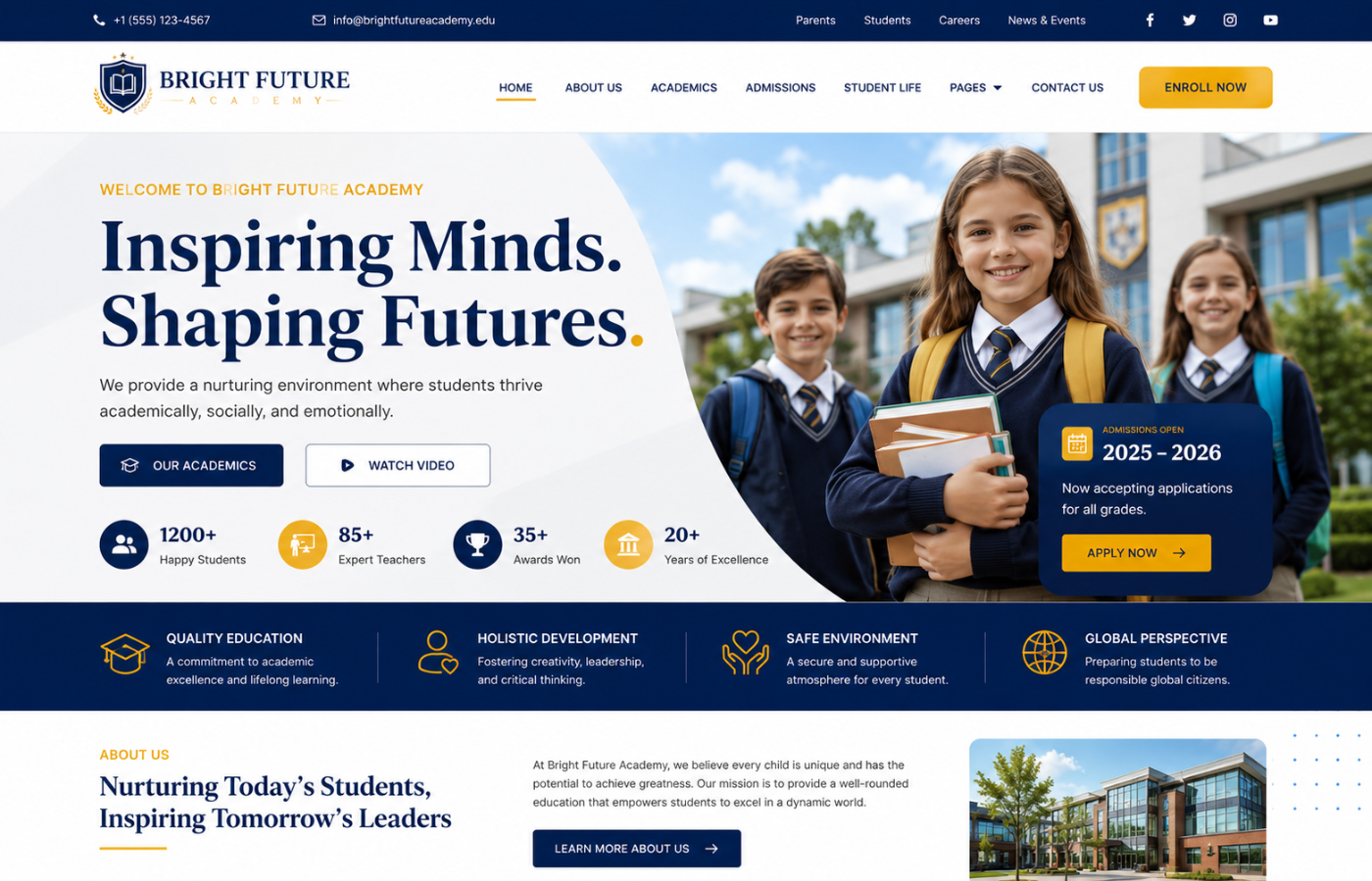
3. The “Above the Fold” Admissions Funnel
Within the first 5 seconds, a parent must see:
-
Your school name and logo
-
A hero image of happy, diverse students learning
-
Two clear buttons: “Book a Tour” and “Download Prospectus”
-
A trust badge (e.g., “Rated Excellent” or accreditation logo)
4. Virtual Tour Integration
Schools that embed a 2-minute video walkthrough of campus see 35% more tour bookings. Place this video on the homepage and the admissions page.
5. Academics + Outcomes in Plain Language
Parents want to know: “Will my child succeed here?” Instead of jargon, publish:
-
Exam results (in simple charts)
-
University acceptance lists
-
Student testimonial videos (30 seconds each)
6. Easy-to-Find Fee & Financial Aid Information
Hidden pricing is the #1 reason parents abandon school websites. Create a dedicated, simple “Fees & Assistance” page with:
-
Tuition ranges (tiers are fine)
-
Scholarship application deadlines
-
A one-click contact for financial aid questions
7. Conversion-Optimized Admissions Forms
Most school forms ask for too much, too soon. Instead:
-
Step 1 (low friction): Name + email + “Send me the prospectus”
-
Step 2 (after trust is built): Phone number + child’s grade level
-
Step 3 (final): Schedule a tour date
8. Social Proof at Every Decision Point
Add short parent testimonials next to every call-to-action. Example: “We toured three schools, but the website made it so easy to book a visit here. Our daughter loves it.” — Sarah, parent of Year 4 student
Quick Audit Table: Where Does Your School Stand?
| Element | Red Flag (Fix Now) | Green Flag (Admissions-Ready) |
|---|---|---|
| Mobile Load Time | > 3 seconds | < 1.5 seconds |
| “Apply” Button Visibility | Hidden in footer | Sticky on every page |
| Virtual Tour | None or broken YouTube link | Native video + captions |
| Fee Transparency | “Call for price” only | Clear ranges + FAQ |
The Psychological Shift: From Information Site to Admissions Engine
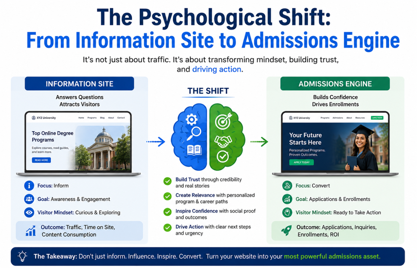
Most school websites are designed like brochures—static, pretty, and passive. But effective web design for schools treats every page as a conversion path. That means:
-
The “About Us” page ends with a tour button
-
The “Curriculum” page offers a downloadable guide in exchange for an email
-
The “Contact” page shows a map, hours, and a live chat option
Conclusion: Your Website Is Your Best Recruiter
Want a school website that turns curious parents into enrolled families — with clear admissions pathways, virtual tours, and trust signals that set you apart from every other local school?
Get in touch with Orbitix today.