






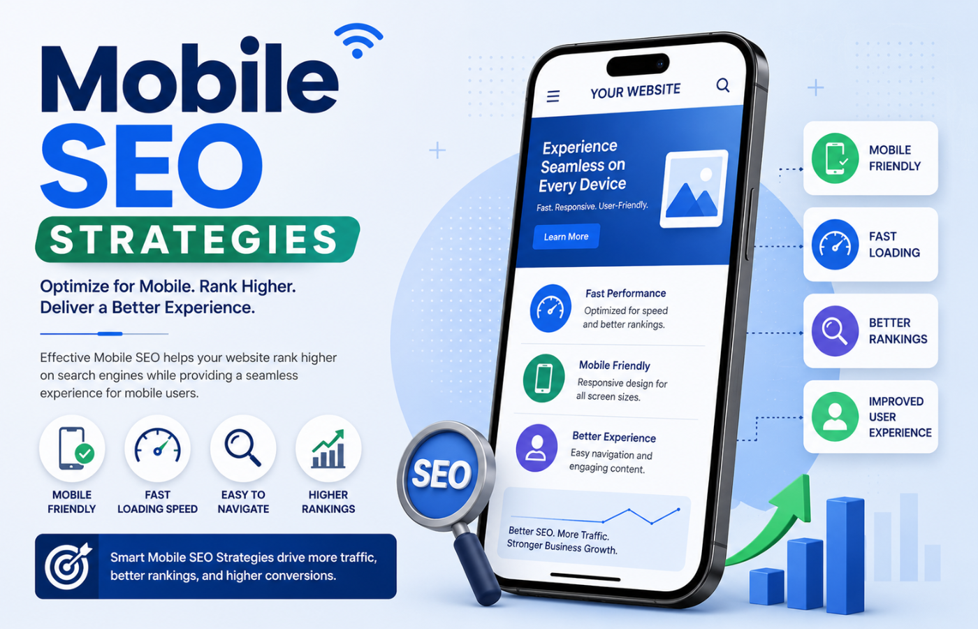
Mobile SEO Strategies to Improve Rankings and User Experience
Why Mobile SEO Matters More Than Ever
Google’s mobile-first indexing means that if your mobile site is slow, poorly structured, or difficult to navigate, your desktop rankings will also decline. Mobile users have zero patience — 53% abandon a site that takes over 3 seconds to load. Additionally, mobile search intent is often more urgent and local: users searching for “plumber near me” or “open now” expect immediate answers and easy click-to-call functionality. Mobile SEO strategies address these realities head-on.
Essential Mobile SEO Strategies for Better Rankings and UX
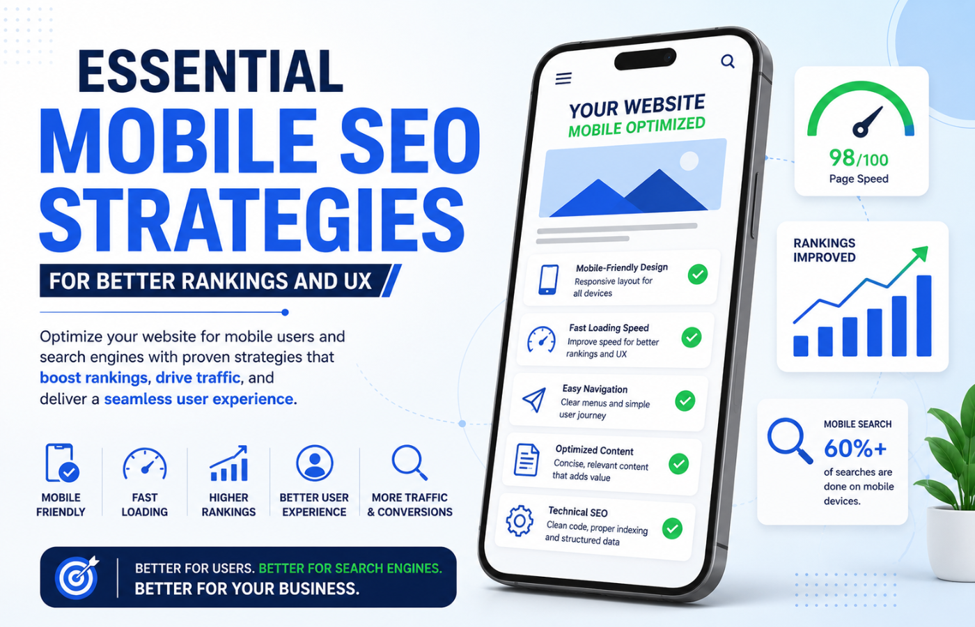
Implementing effective mobile SEO strategies requires attention to several critical areas:
1. Responsive Design (Not Separate Mobile URLs)
Google recommends responsive design over separate mobile subdomains (m.yoursite.com). One site, one URL, one set of content — adaptable to any screen size.
Why it helps: Easier for Google to crawl and index; no duplicate content issues; better user experience across devices.
2. Page Speed Optimisation
Speed is a direct ranking factor and a major UX concern. Key tactics include:
-
Image optimisation: Compress images, use WebP format, implement lazy loading
-
Minify CSS, JavaScript, and HTML: Remove unnecessary code
-
Enable browser caching: Store static assets locally on user devices
-
Use a CDN (Content Delivery Network): Serve content from servers closer to users
-
Reduce server response time (TTFB): Optimise hosting, use caching plugins
Target: Largest Contentful Paint (LCP) under 2.5 seconds.
3. Mobile-Friendly Navigation
Navigation designed for thumbs, not mice:
-
Hamburger menus (collapsible, space-saving)
-
Large, tappable buttons (minimum 44×44 pixels)
-
Sticky navigation (menu follows as user scrolls)
-
Search bar prominently placed (mobile users prefer search over browsing)
4. Viewport Configuration
Correct viewport meta tag ensures proper scaling:
<meta name="viewport" content="width=device-width, initial-scale=1.0">
Without this, mobile users see a zoomed-out desktop version — a terrible UX.
5. Readable Font Sizes
Text should be readable without zooming:
-
Body text: 16px minimum (18px recommended)
-
Headings: 20px+ for H2s, 24px+ for H1s
-
Sufficient contrast between text and background
6. Click-to-Call & Mobile CTAs
Mobile users want immediate action:
-
Click-to-call buttons (tel: links) on every page
-
Tap-to-text for SMS enquiries
-
One-click directions (Google Maps integration)
-
Sticky CTAs that follow as users scroll
7. Avoid Pop-Ups and Interstitials
Google penalises intrusive pop-ups that block content on mobile:
-
No full-screen interstitials on entry
-
No “app download” banners that dominate the screen
-
Use small, dismissible banners instead
8. Mobile-First Content Formatting
Content must be scannable on small screens:
-
Short paragraphs (2-3 sentences max)
-
Bullet points and numbered lists (easier to scan)
-
Subheadings every 2-3 paragraphs (break up text)
-
Images and videos that are properly sized (not wider than screen)
-
No horizontal scrolling (content should fit screen width)
9. Touch-Friendly Forms
Forms should be painless to complete on mobile:
-
Large input fields (easy to tap)
-
Minimal fields (name, phone, email — that is it)
-
Auto-fill and auto-complete (save typing)
-
Clear error messages (highlight missing fields)
-
Large, tappable submit buttons
10. Optimise for Local Mobile Searches
Mobile searches often have local intent:
-
Claim and optimise Google Business Profile
-
Include location keywords (“near me,” neighbourhood names)
-
Embed Google Maps with your location
-
Add local schema markup (LocalBusiness, geo-coordinates)
Quick Mobile SEO Checklist
| Area | Action | Status |
|---|---|---|
| Responsive design | One site, all devices | ☐ |
| Page speed | LCP under 2.5s, images compressed | ☐ |
| Navigation | Thumb-friendly, sticky menu | ☐ |
| Viewport | Correct meta tag | ☐ |
| Font sizes | 16px+ body text | ☐ |
| Click-to-call | Phone button on every page | ☐ |
| Pop-ups | No intrusive interstitials | ☐ |
| Content | Short paragraphs, bullet lists | ☐ |
| Forms | Large fields, minimal required | ☐ |
| Local SEO | GBP claimed, local schema | ☐ |
Common Mobile SEO Mistakes
| Mistake | Why It Hurts | Fix |
|---|---|---|
| Blocking CSS/JS | Google cannot render mobile version | Allow crawling of all assets |
| Tiny tap targets | Frustrating navigation | Minimum 44x44px buttons |
| Content hidden on mobile | Users miss critical info | Show same content on all devices |
| Slow images | Pages load slowly | Compress, WebP, lazy load |
| No viewport meta | Desktop version on mobile | Add viewport meta tag |
| Autoplay video | Data usage, annoyance | User-initiated play only |
Testing Your Mobile SEO
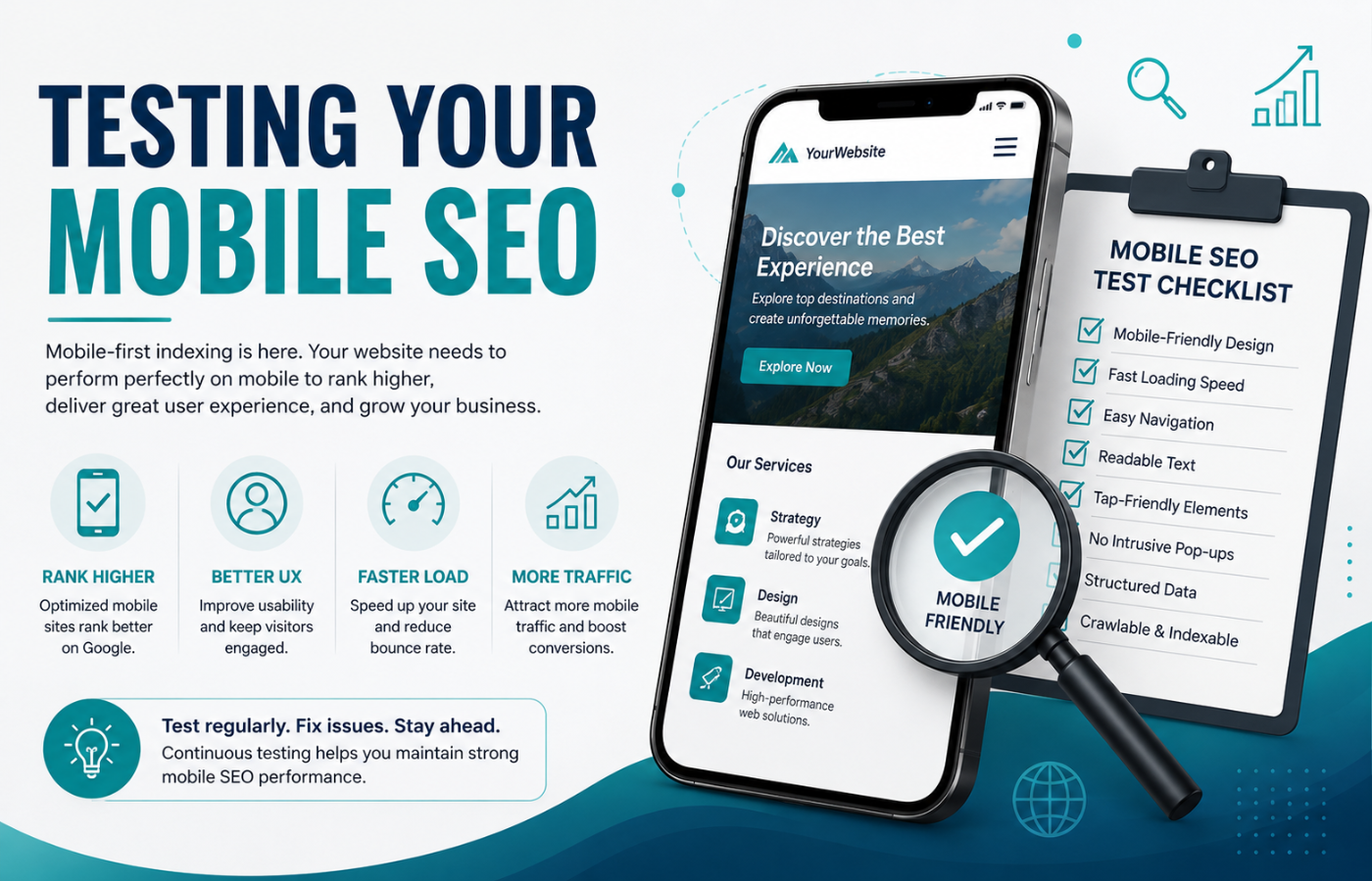
Use these free tools to test your mobile performance:
-
Google Search Console: Mobile Usability report (identifies issues)
-
Google PageSpeed Insights: Mobile speed score with specific fixes
-
Google Mobile-Friendly Test: Pass/fail with detailed feedback
-
Lighthouse: Performance, accessibility, and SEO audit
-
Browser developer tools: Device emulation to preview mobile experience
Conclusion: Mobile-First Is the Only Way Forward
Want mobile SEO strategies that boost your rankings and keep mobile visitors engaged — with faster load times and better conversions?
Get in touch with Orbitix today.