


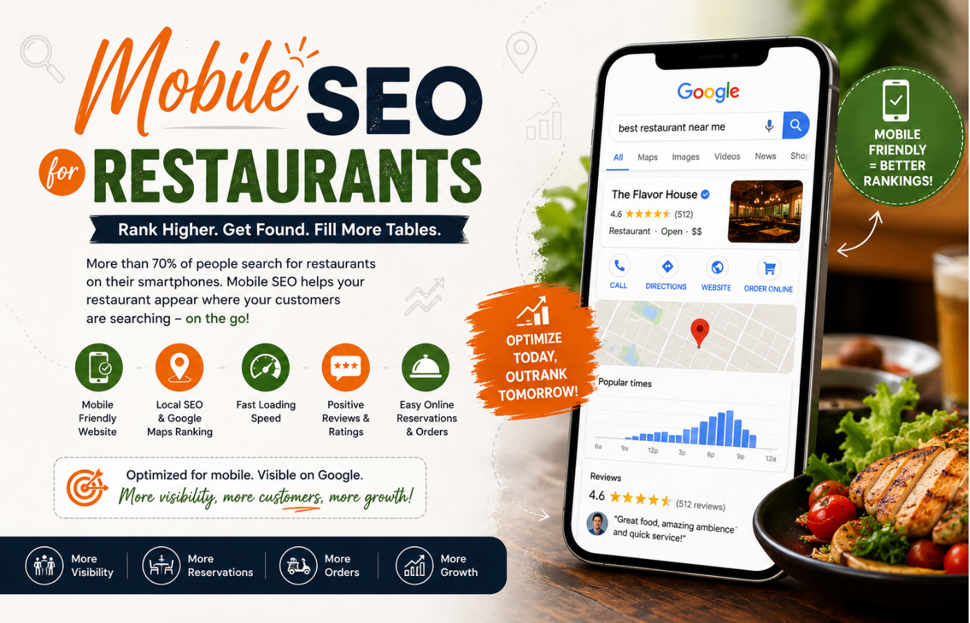
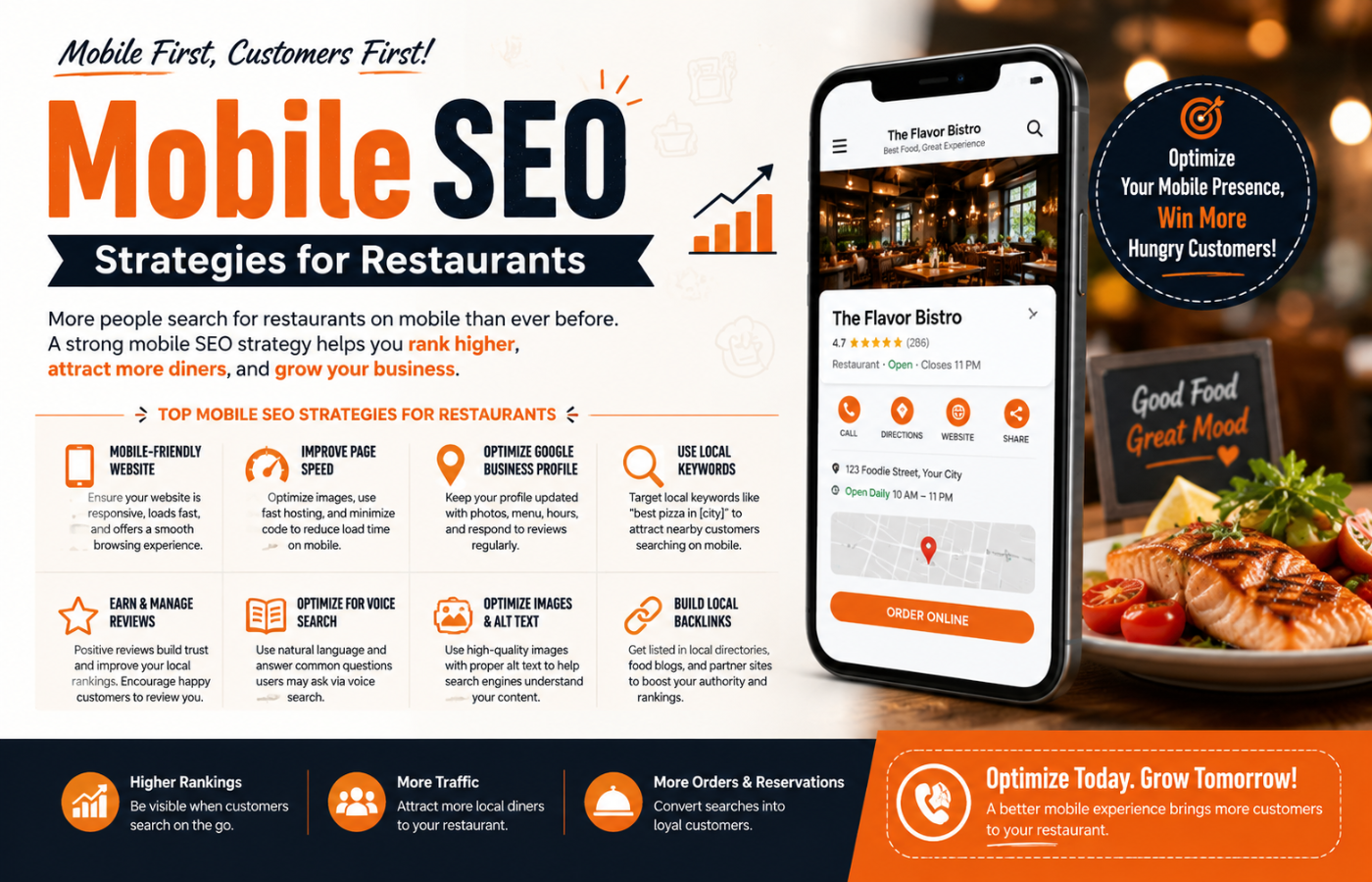
Mobile Local SEO for Restaurants: Why It Matters More Than Ever
In an era where 60% of all organic search traffic comes from smartphones, mastering Local SEO for restaurants is impossible without a mobile-first mindset. When a potential diner is walking down the street with a rumbling stomach, they don’t head home to a desktop; they pull out their phone and search for “best pizza near me” or “restaurants open now.” If your restaurant’s website isn’t optimized for that tiny screen, you aren’t just losing a visitor—you are losing a customer to the competitor whose mobile site loads instantly and lets them book a table with two thumb taps. This detailed guide will walk you through exactly why mobile SEO dominates the hospitality industry, how to fix common mobile errors, and how to turn smartphone glances into guaranteed dinner reservations.
What is Mobile SEO (And Why Is It a Survival Skill for Restaurants)?
Mobile SEO refers to the practice of optimizing your website for search engines specifically based on how users interact with their smartphones and tablets. Unlike desktop SEO, mobile SEO prioritizes speed, tap targets, vertical navigation, and local intent. For restaurant owners, this isn’t just technical jargon—it is the difference between a full dining room and a silent reservation line.
Core Components of Mobile SEO for Restaurants
To dominate local mobile searches, you cannot just shrink your desktop site. You need a specific technical and content strategy. Let’s break down the pillars of successful SEO for restaurants in a mobile environment.
1. Speed: The 3-Second Rule
Mobile users are impatient. According to Google, 53% of mobile users abandon a site that takes longer than three seconds to load. For a restaurant, every second of delay means a potential diner giving up and calling your competitor.
-
How to fix it: Use Google’s PageSpeed Insights tool. Compress images (a 5MB photo of your signature dish is a disaster), eliminate render-blocking JavaScript, and leverage browser caching.
-
Restaurant specific tip: Reduce the size of your menu PDF. Better yet, convert your menu to HTML text so it loads instantly.
2. Touch-Friendly Navigation (Tap Targets)
Ever tried to click a tiny “Reservations” button on a phone and accidentally hit “Directions” instead? That is a poor mobile experience. Google looks at “tap targets” (buttons, links, menu icons) to ensure they are large enough for a finger.
-
The standard: Buttons should be at least 48px wide with adequate spacing.
-
Restaurant specific tip: Make your phone number a click-to-call button. Make your address a “tap-for-directions” link. This reduces friction.
3. No Pop-Ups (Interstitials)
Google penalizes mobile sites that use intrusive pop-ups that cover the main content. If a user searches for your lunch hours but sees a huge “Download Our App” modal that blocks the screen, they will bounce.
-
The fix: If you use a pop-up for a loyalty program, ensure it appears at the bottom of the screen or after a delay, and that it is easy to dismiss (a clear “X” in the corner).
4. Local Intent & Voice Search
Most mobile restaurant searches happen on the go. People ask their phones: “Hey Siri, where can I get vegan tacos?” This is voice search.
-
Optimization strategy: Write your content in a natural, conversational tone. Create an FAQ page answering “Do you have outdoor seating?” or “Are you open on Mondays?”
-
Local pack dominance: Ensure your Google Business Profile is synced with your mobile site. When you update your holiday hours on your site, they should match your GBP instantly.
The Technical Audit: Is Your Restaurant Mobile-Friendly?
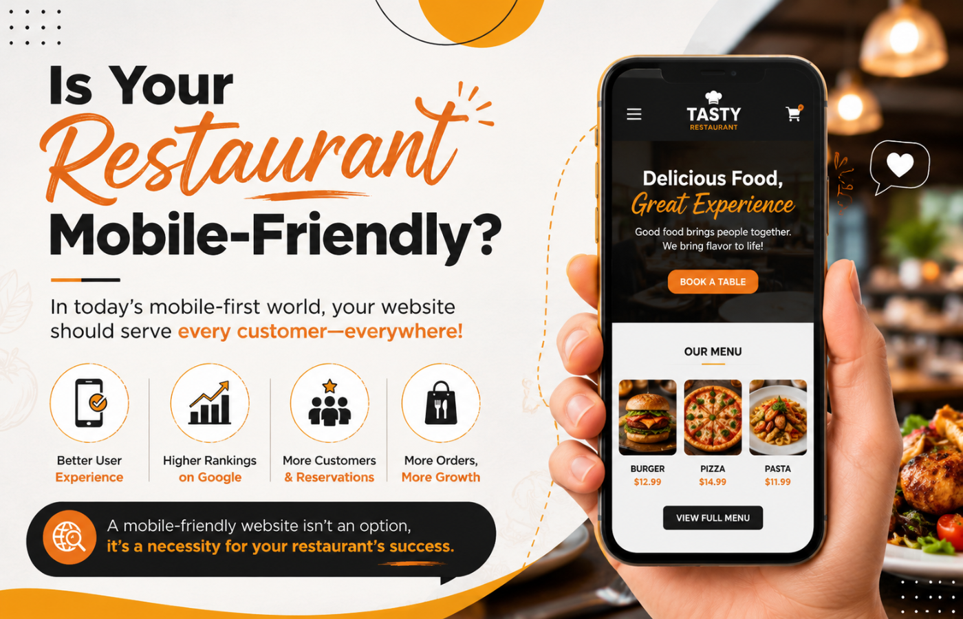
You cannot guess if your site is mobile-friendly; you must test it. Follow this checklist for SEO for restaurants survival.
Use Google’s Mobile-Friendly Test
Enter your URL into Google’s Mobile-Friendly Test tool. It will tell you exactly what is wrong: text too small, viewport not set, clickable elements too close.
Check Viewport Configuration
Your HTML header needs this line: <meta name="viewport" content="width=device-width, initial-scale=1.0"> Without this, your site will look like a shrunken desktop page.
Avoid Flash or Silverlight
These technologies don’t work on iPhones or modern Android devices. Use HTML5 for any animations or video.
Font Sizes
Ensure your body text is at least 16px. Anything smaller forces users to pinch and zoom, which Google interprets as poor usability.
On-Page Content Strategy for Mobile Diners
Mobile users have different intent than desktop users. When optimizing SEO for restaurants, you need to answer the “Micro-Moments” – I-want-to-go, I-want-to-know, I-want-to-buy.
The “Above the Fold” Menu
On mobile, “above the fold” is about the first 300 pixels. Do not waste this space with a hero image of your building. Use it for:
-
Your logo and name
-
A “Book a Table” button
-
Today’s hours
-
The current wait time (if applicable)
Structured Data for Restaurants (Schema)
Schema is code you put on your site to help search engines understand your content. For mobile, this is critical.
-
Menu Schema: Allows Google to display your actual menu items directly in search results (e.g., “Burger: $12”).
-
Opening Hours Schema: Tells Google exactly when you are open, which is crucial for “near me” searches.
-
Reservation Schema: Connects your OpenTable or Resy widget directly to Google Search.
When you implement Schema correctly, your mobile search result might show stars, prices, and a “Reserve” button before the user even clicks your site.
Simplify Your Forms
Mobile users hate typing. If your “Contact Us” form asks for street address, city, state, zip, and phone number, nobody will fill it out.
-
The fix: Ask only for Name, Email, and Message. Use dropdown menus instead of text fields where possible. Enable autofill for phone numbers.
Local SEO and Mobile – The Perfect Marriage for Restaurants
Optimize Your Google Business Profile (GBP) for Mobile
Your GBP is the first thing mobile users see on the map pack.
-
Attributes: Add “Outdoor seating,” “Takeout,” “Delivery,” “Vegan options,” “Good for kids.” These appear as tiny icons on mobile and drastically filter customers.
-
Q&A: Monitor the Questions & Answers section. Mobile users ask things like “Is there parking?” Answer them promptly.
-
Posts: Use Google Posts to announce “Happy Hour from 4-6 PM.” These appear in mobile search results like mini-ads.
Local Citations & NAP Consistency
Your Name, Address, and Phone number (NAP) must be identical across your mobile site, GBP, Yelp, TripAdvisor, and Instagram. A discrepancy (e.g., “Suite 100” vs “Ste 100”) confuses Google’s mobile algorithm, causing you to drop in rankings.
Encouraging Mobile Reviews
After a diner pays, send a text message (SMS) with a direct link to leave a Google review. Mobile users are 60% more likely to leave a review immediately after a meal because the phone is already in their hand.
Advanced Mobile SEO Strategies for Restaurants
Once you have the basics, implement these power moves to outrank every other eatery in town.
1. Accelerated Mobile Pages (AMP)
AMP is a stripped-down version of HTML that loads almost instantly. While AMP is debated in the SEO community, for restaurant menus and contact pages, it is incredibly effective. Consider creating AMP versions for your menu and location pages.
2. Progressive Web Apps (PWA)
A PWA allows users to “install” your restaurant’s website icon on their home screen without going to an app store. It sends push notifications (e.g., “Lunch special today: $10 burgers”) and loads instantly. This is a huge win for repeat customer SEO.
3. Image Alt Text for Mobile Image Search
Many mobile users switch to “Images” tab to see photos of your food. Ensure every photo of your dishes has descriptive alt text. Instead of “IMG_4532.jpg,” use “wood-fired-margherita-pizza- restaurant-name.jpg.”
4. Targeting “Near Me” Implicitly
You do not need to write “near me” on your page. Google adds it automatically based on the user’s location. However, you should create location pages: /menu-east-side and /menu-west-side if you have multiple franchises.
Common Mobile SEO Mistakes Restaurants Make
Avoid these errors at all costs.
| Mistake | Consequence | Fix |
|---|---|---|
| PDF Menu only | User has to pinch, zoom, and download a huge file. | Convert to HTML text menu. |
| Horizontal scrolling | Site requires swiping left/right to read a sentence. | Use responsive CSS (width: 100%). |
| Blocked resources | Google cannot load your CSS/JS, so your site looks broken. | Check robots.txt to ensure assets are crawlable. |
| Irrelevant redirects | Desktop user goes to /home; mobile redirects to /m/home (different URL). |
Use responsive design (one URL for all devices). |
Measuring Your Mobile SEO Success
You cannot improve what you don’t measure. Use these tools to track your SEO for restaurants mobile performance.
Google Search Console
Go to the “Mobile Usability” report. It will list every page that has touch elements too close, viewport errors, or font size issues.
Google Analytics 4 (GA4)
Segment your traffic by “Device Category” (mobile vs. desktop). Look at the bounce rate. If your mobile bounce rate is 20% higher than desktop, your mobile experience is broken.
-
Check: Average session duration on mobile. If it is very low, users aren’t reading your menu.
Real User Monitoring (RUM)
Tools like Treo or Sematext track how real customers experience your site speed. If your Core Web Vitals (Largest Contentful Paint, First Input Delay, Cumulative Layout Shift) fail on mobile, Google will demote you.
Case Study: How One Diner Tripled Reservations via Mobile
Let’s look at a realistic scenario. “Sunset Bistro” was a casual dining spot ranking on page 3 for “brunch near me.” Their desktop site was fine, but their mobile site took 6 seconds to load, and the menu was a blurry PDF.
Actions taken:
-
Compressed hero images from 2MB to 100kb.
-
Switched from a PDF menu to an HTML collapsible menu (accordion style).
-
Added “Click to Call” and “Tap for Directions” to the header.
-
Implemented Restaurant Schema (Menu & Hours).
-
Asked 20 loyal customers to leave Google reviews via SMS link.
Results after 60 days:
-
Mobile load time dropped from 6 seconds to 1.8 seconds.
-
Bounce rate decreased by 45%.
-
Local Pack ranking moved from #9 to #3.
-
Mobile reservations (via OpenTable) increased by 187% .
This proves that SEO for restaurants is not about tricking Google; it is about serving the hungry customer on the go.
Conclusion: The Future is Handheld
If your restaurant is ignoring mobile SEO, you are effectively turning away customers at the door. The modern diner doesn’t call for reservations; they tap an app. They don’t print directions; they ask Siri. They don’t download PDFs; they scroll.
Remember, in the world of SEO for restaurants, the best seat in the house is the top of the mobile search results. Claim it before your competitor does.
Want to rank higher and attract more customers?
Get in touch with Orbitix today.